
Does the graph create the impression that Peyton Manning has about 10 times as many pass attempts as Russell Wilson?
One approach would be to show students the graph and ask how this visual representation could be misleading. Point to the sizes of the circles.
A different approach could be to remove information (and add perplexity). Show them this:

Have students estimate Peyton Manning’s career pass attempts. I’m anticating many students will compare the sizes of the circles. They’ll think about how many green circles could fit in the orange circle. They may not think 100, but I’m confident they’ll think much more than 10. They may have other strategies. Have students share them.
Give students rulers (and the formula A = πr² if they ask for it). Ask them if they’d like to revise their estimate.
Reveal this:
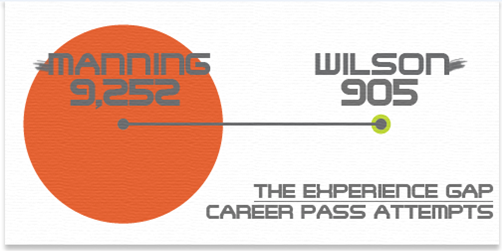
Were students misled? I’m anticipating some will compare the diameters. Take advantage of that. If not, challenge them to find out why the circles are the sizes they are.
Given Manning’s circle, have students draw Wilson’s circle to the correct size. Again, have students share strategies.
(I’ve created this applet in GeoGebra. Not sure what, if anything, it gets me.)

Allowing students to possibly be misled by a misleading graph… should’ve thought of that earlier.
I don’t think @ESPNStatsInfo is trying to suggest a much wider experience gap. Seahawks fans may disagree, but the tweet backs me up. This is accidental: the result of focussing on graphic, not info, in infographic.
