Dollars to Donuts

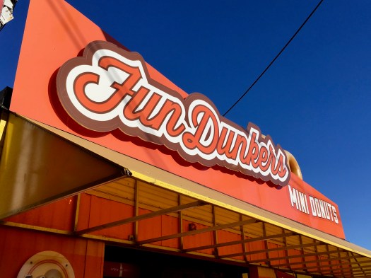
A week and a half ago, I was at The Fair and noticed this:

FunDunkersFunDunkers1thoselittleDONUTSthoselittleDONUTS1

Two different mini donut vendors, two different sets of prices. I wondered “What’s the best deal?” As much as I love asking students “What do you notice? What do you wonder?” when introducing problems–see this introduction to “I Notice, I Wonder” from The Math Forum— I’m thinking about skipping this routine here and just presenting the context and problem (using these photos). Let me explain that decision later in this post.

I love best buy problems because they lend themselves to multiple strategies. From students, not “let me show you six different ways to solve these.” For example, I anticipate that many–most?–students will determine and compare unit rates. It’s an intuitive thing to do. (Or not. See Robert Kaplinsky’s discussion of his Carnival Tickets task.) At FunDunkers, it’s $12 for 3 bags, or $4 per bag; at those little DONUTS, it’s $10 for 2 bags, or $5 per bag. Winner: FunDunkers. Students may also think common multiples (or scale up). At Fundunkers, it’s $12 for 3 bags, so $24 for 6 bags; at those little DONUTS, it’s $10 for 2 bags, or $20 for 4 bags, or $30 for 6 bags. We can easily compare ratios or rates when one term is the same, be it one bag or six.

After having some students present their solutions, I’d display these photos…

FunDunkers2
FunDunkers
thoselittleDONUTS2
those little DONUTS

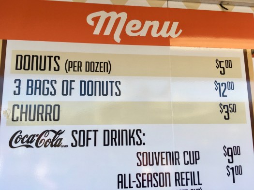
… and ask students if they’d like to revise their solutions. Now, students will likely determine and compare new unit rates. “One” has changed: dollars per one donut instead of dollars per one bag (#unitchat). Here some students may also consider one dollar to be the unit (and avoid fractions or decimals in doing so). At FunDunkers, it’s 36 donuts for $12, so 3 donuts per dollar; at those little DONUTS, it’s 45 donuts for $15, so 3 donuts per dollar. A tie. Less interesting than a reversal but, hey, “real world” numbers.

I like the teacher move of gradually providing students with new information and asking them if they’d like to revise their thinking. (It’s a strategy I used with Sinusoidal Sort and “Selfiest” Cities.) Not all the time. But in this task, if students wonder how many donuts are in each bag, then you kinda have to provide this up front. This means that we might not get the dollars per bag idea on the table at all–a missed opportunity to compare and connect strategies.

(Anyone else notice my donut hole-like tunnel vision in that last FunDunkers photo? One step back and maybe there’s a math task involving souvenir cups and pop refills.)

On Pace

Act 1

Steph Curry On Pace Headline Retouch

The retouched headline is designed to have students ask “How many 3-pointers will Stephen Curry make this season?” There are related questions: “At what pace (rate) is Curry making 3-pointers? What makes this pace historically ridiculous? What’s the difference between a historically ridiculous pace and a ridiculously historic pace?”

Here’s the thing about historic paces: historically, they happen weekly.

history-making historically dominant

Act 2

I retouched the first sentence in the article to open things up a bit. Pre-edit: “We’re nearly through 20 percent of the 2015-16 season…” Only the number of 3-pointers made to date (74) is needed. We don’t need to know the number of games played to date (15) or the number of games played in an NBA season (82). That’s the point of percent: fanatical comparison to 100. (I wonder if students would ask for this superfluous information anyway.) Post-edit, this information might, in fact, be useful to know. And help draw out multiple strategies. Perhaps students will ask for a fraction, rather than a percent, to fill in the blank. Games played and 3-pointers made to date can be determined from the following graph:

Steph Curry On Pace Graph 1:2

I cropped the infographic because it resolves an extension (see it from the waist down below). And because it’s too damn long.

Act 3

Steph Curry On Pace Headline

The article suggests two possible extensions: “How many 3-pointers does Steph Curry need per game remaining to reach 300? How many games will this take?”

Steph Curry On Pace Graph 2:2

Source: http://www.cbssports.com/nba/eye-on-basketball/25386027/steph-curry-3-point-tracker-on-pace-for-404-makes-in-2015-16

April 7, 2016: Steph Curry Is On Pace To Hit 102 Home Runs

May 11, 2016: 3-Point Tracker — 2015-16 Season

May 11, 2016: Misleading y-axis (h/t Geoff Krall)

Cola Comparison

Coke is now sold in 20, not 24, packs!

Coke 20 (2)
Coke 12 (2)
Pepsi 24 (2)

So to determine the best buy, I couldn’t just double. I use that strategy all the time; it’s my Frank’s RedHot. The exclamation point is there because I think that 20 leads to more strategies than 24. (Some of) these strategies are listed in my 5 Practices monitoring tool below. I’m curious if you think that I have anticipated likely student responses correctly. What incorrect strategy could I have anticipated? I wonder how you’d purposefully sequence these responses during the discussion.

0001ar

More than SWBAT solve problems using unit rates, I want my students to recognize that there are many ways to solve rate problems and understand that we can easily compare rates with one term the same. This big ideas connects the strategies. In the fourth strategy above, we can think of 24 cans as a unit. Call it a “two-four” (Is that just a Canadian convention?) or a “flat” (Are we cool with calling the Pepsi cube a flat?). In fact, Save-On-Foods wants us to think of 24 as one; we’re encouraged to buy two packs of 12, a composed unit. For this task, I’d prefer that they didn’t, so I went back to the store and found this:

Cola 12

Comparing 20 packs with 15 packs is more likely to lead to common multiples than comparing 20 packs with 24 packs as above. Numbers matter. There’s this, but it doesn’t get us a clear winner:

Pepsi 15

Recommended: Dan knocks motivating unit rates out of the park; Christopher asks “What is one?” 

May 13, 2016: de La Cruz, Jessica and Sandra Garney. 2016. “Saving Money Using Proportional Reasoning.” Mathematics Teaching in the Middle School 21 (9): 552-561.

World’s Worst Person In Sports

Last week, Keith Olbermann named the Canucks’ Tom Sestito “World’s Worst Person In Sports.” In a game against the Kings, Sestito racked up 27 penalty minutes. His total ice time for the night? One second.

27:00 to 0:01 is an impressive stat. It’s hard to imagine this being surpassed. Sure, twenty-seven minutes can be topped. Randy Holt holds the NHL record for most penalty minutes in one game (67). The NHL record for most penalties in one game (10) belongs to Chris Nilan. But to do so in one second?! Inconceivable.

“I’d describe [Sestito] as a hockey player except he’s not,” Olbermann says. To make this point, he goes on to compare Sestito to Gretzky. That’s right: “The Great One” is his hockey player/”boxing hobo on skates” referent. In 101 games, Sestito had scored 9 goals, 885 shy of Gretzky’s record. Olbermann notes that Sestito would have to play about 10 000 games, or 123 seasons, to break the NHL record. Well, yeah, assuming he can keep up this pace.

I considered giving this the three-act treatment and bleeping Olbermann. But “When will Sestito break Gretzky’s record?” is not the first question that comes to your mind, is it? A more natural question re: Sestito might be “How many seasons would Sestito have to play to break Dave “Tiger” Williams’ record of 3966 career PIMs?” Apples to apples.

Olbermann, 54, followed this up by feuding with Tom Sestito’s sister, 13, on Twitter. Nice use of a unit rate by the kid:

https://twitter.com/vsestito32/statuses/423291409937235968

A Turkey of a Graph

This news story could make for an engaging math task. The reporter even lists some questions students may have.

Thanksgiving

But what I really want to know is …

what is this?

Thanksgiving Graph

Graphs should reveal information about a situation (e.g., relationships, trends). Does this graph do that? The pictograph is cute, but does it suit the data? Choice of format aside, what’s with the different symbols/scales between categories? The reader can compare pounds of mashed potatoes to pounds of vegetables (kind of) and litres of gravy to litres of cranberry sauce, but what conclusion can he or she draw from comparing the mashed potato category to the gravy category (or to turkeys, rolls, or pies, for that matter)? And the spacing? At first glance, it looks like there are 80, not 100, pounds more mashed potatoes than vegetables. But wait–there’s an extra partial column of broccoli. At least it wasn’t Brussels sprouts.

Happy Thanksgiving.

Related:

xkcd: Tall Infographics

Like Bono, I’m singing “We’re one, but we’re not the same”

Today, the threat of an NHL lockout draws nearer. The league and its players have a pile of money and little regard for their customers. Kinda like these two:

Lockout or not, it is that time of year. Some hockey talk:

Well it’s too late tonight
To drag the past out into the light

In 2003, the Vancouver Canucks faced the Dallas Stars in the first round of the Stanley Cup playoffs. Canucks fans may remember the opening game of this series as the one in which Henrik Sedin scored the game-winning goal late in the fourth overtime period. They may also remember it as the most boring playoff series ever. Considering the series went 7 games and 3 games went to overtime, this was no easy feat. In the middle of the series, the final scores were 0-2, 2-1, 2-1, and 1-0. During this stretch, the colour commentator said something like “Turco has a save percentage of 0.960, but he’s gotta be frustrated because the guy at the other end [Luongo] is playing twice as good”. Luongo’s save percentage was 0.980¹.

This floored me. How can that be? We’re talking about a difference of only 2 percentage points. He must have made a mistake. Twice as good?

The answer lies in part-part-whole relationships. What if we focussed on the other part in this part-part-whole relationship, the goals against?

What if, rather than save percentages, goalies’ goals against percentages were discussed? Let’s abbreviate this as a goalie’s GAP. Heh. Seems fitting:

Turco’s GAP would be 0.040; Luongo’s 0.020. Yep. Harry Neale was right. A GAP of 0.020 is twice as good as a GAP of 0.040 since 0.020 × 2 = 0.040. Still, we’re talking about a difference of only 2 percentage points.

Is it getting better?
Or do you feel the same?

But wait. GAP is a unit rate. We’ve been talking about unit rates on this blog. Luongo’s GAP of 0.020 means 0.020 goals per one shot against (or 20 goals per 1000 shots against). This can also be expressed as one goal per 50 shots against (1/0.020 = 50). Turco’s GAP of 0.040, on the other hand (the left one), means 0.040 goals per one shot against. This can be expressed as one goal per 25 shots against. Let’s call this a goalie’s Shots Against per Goal, or SAG. Fifty versus 25 seems like a much bigger difference than 98 versus 96. Just visualize the bar graphs.

Did I disappoint you?
Or leave a bad taste in your mouth?

In Vancouver, the goalie controversy is proceeding to its logical conclusion.

For your consideration:

Roberto Luongo
Save Percentage (Sv%) = 0.919
Shots Against per Goal (SAG) = 1/(1 − 0.919) = 12.35

Cory Schneider
Save Percentage (Sv%) = 0.937
Shots Against per Goal (SAG) = 1/(1 − 0.937) = 15.87

Just for fun, here’s one more:

Dwayne Roloson
Save Percentage (Sv%) = 0.886
Shots Against per Goal (SAG) = 1/(1 − 0.937) = 8.77

Will it make it easier on you now?
You got someone to blame

Remember this guy? Let’s not go there.

¹Made up numbers. By me.

Hey, I just met you and I wanna rock your gypsy soul

Carly Rae Jepsen’s “Call Me Maybe” passed Van Morrison’s “Into the Mystic”.

I’m referring to my iTunes library, of course.

It wasn’t me. Meet the culprits:

First, “Van the Man”. On October 13, 2008, I added “Into the Mystic” to my library (‘Date Modified’ in iTunes). I’m calling this t = 0. I’ve played it 62 times. I last played this “song of such elemental beauty and grace” 1284 days later on April 19, 2012.

Jepsen’s up next. “Call Me Maybe” was added (not by me) on February 28, 2012. This is 1233 days after I added “Into the Mystic”. Seventy-five days later, on May 13, 2012, I listened to this sugary pop tune for the 63rd time. This is 1308 days after adding “Into the Mystic”.

NB: Screenshots of the iTunes Summaries for both songs would make a better first act. Here’s the summary for “Call Me Maybe”:

My initial questions were:

  • When did this happen?
  • Could I have predicted this?
  • How will the number of plays compare in the future?

I modelled this situation using a system of linear equations. For the Irish singer-songwriter, we get p = 0.05d, where p is the number of plays and d is the number of days. For the Canadian Idol, we get p = 0.84d − 1035.72.

Comparing slopes is an obvious discussion topic. The line for “Call Me Maybe” is much steeper than the line for “Into the Mystic”; the rate of change is 0.84 plays/day versus 0.05 plays/day.

This problem can also be used to explore unit rates. Unit rates can be expressed in more than one way. It’s about what one is one.

I wanted to express the equation p = 0.84d − 1035.72 in the form p − 63 = 0.84(d − 1233). Slope-point form tells a better story than slope-intercept form in this situation but my GeoGebra skills are rusty.

Having students look at their own iTunes libraries might make a better investigation than practicing solving catch-up problems like this:

I assumed that this situation could be modelled using linear relations. For “Into the Mystic”, fair enough. I think this reasonably approximates the real data. Outside of perhaps when I was commenting on Michael Pershan’s blog, I didn’t go through a Van Morrison phase. Van Morrison is in my wheelhouse and “Into the Mystic” is just in the rotation. The number of plays per day is (almost) constant.

For “Call Me Maybe”, this assumption is likely incorrect. The song’s got legs but the instantaneous rate of change has to be decreasing, right? For my mental health, I hope it is. That many plays would surely take its toll.

And what if Carly has competition?

What if I modelled this using a logarithmic function? Check this out:

Note that ≈ 5½ years after first being added to my library, “Into the Mystic” can be expected to pass “Call Me Maybe”. The natural state of the universe is restored.

Update: I learned how to animate my GeoGebra construction. Also, I corrected a math mistake. (What was my misconception?)