Plotting Uses of Technology for Learning

How can technology be best used as a tool for learning mathematics? Calculators can assist with computations when learning other mathematics. iPads can help students communicate their learning. I’m asking about something else. I’m asking about the use of technology to develop new mathematical understandings.

Last week, Marc and I explored this question with about twenty math department heads. First, teachers were given time to explore several dynagraphs. In this version, the equation of each function was hidden. This became the problem to solve.

Following this activity, we wanted to discuss the question above. One approach would be to present several different examples and evaluate each, sharing our criteria. Not very effective. It’s our evaluation, our criteria.

Inspired by this
xkcd
xkcd

we came up with the following:

Technology for Learning 1

After generating a list of possible uses, teachers were asked to plot them in the plane. For example:

Technology for Learning 2
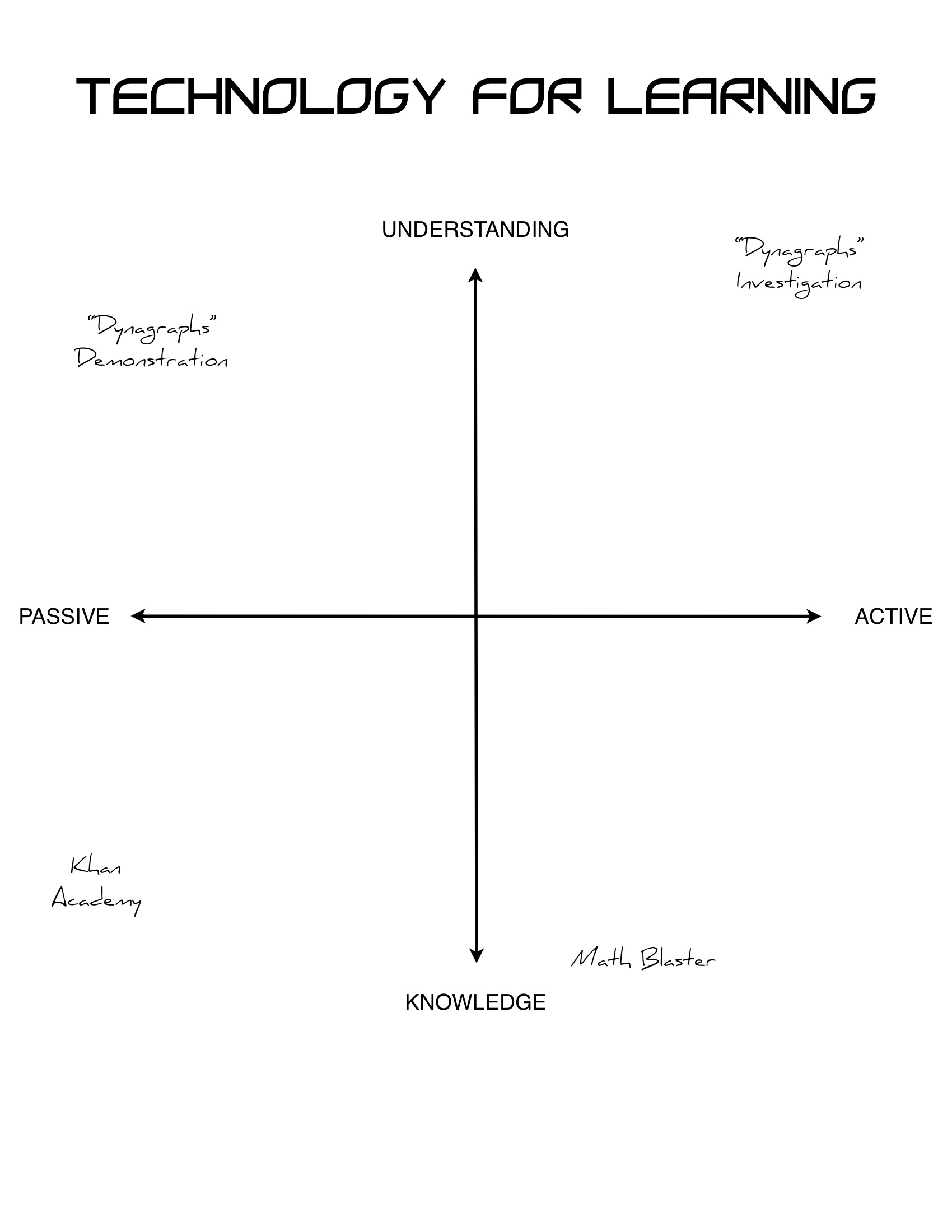
Quadrant I: The dynagraphs investigation was placed in the first quadrant (active-understanding). The NCTM Illuminations Pan Balance applet can also be placed here. In this quadrant, learners build depth of conceptual understanding, be it of function relationships or algebraic thinking, through problem solving. Learners encounter many, if not all, of the seven mathematical processes identified in the curriculum. They communicate mathematical ideas, make connections among mathematical concepts and to past experiences, reason and justify their mathematical thinking, and use visualization to make sense of mathematics.

Quadrant II: An alternate version of dynagraphs was placed in the second quadrant (passive-understanding). The equation is no longer hidden, thereby replacing problem solving with observation. My GeoGebra material also fits here. You know the type: drag a slider (or, worse, watch the teacher drag the slider); what do you notice?

Quadrant III: Ah, yes, Khan Academy. Enough said? Probably not. Activity is limited to pressing pause and rewind. The “intuition” video comes later, if at all. In the third quadrant (passive-knowledge), learners consume content.

Quadrant IV: In the fourth quadrant (active-knowledge), you will find Math Blaster, an iPad app in which students practice math facts (+, −, ×, ÷) through gameplay.

Many interesting comments were made by the group. Some highlights:

“It’s about teaching, not technology.”

Activities can slide from the first quadrant. Who’s doing the math? If it’s the teacher, then we’ve moved to the left. Is the focus on “how-to’s” or essential understandings? If it’s the former, we’ve shifted down. The same holds true for uses of manipulatives.

“We can’t always be in the first quadrant.”

Fair enough. This activity provides one answer to the opening question. Quadrant I is the ideal. Is there value in quadrants two through four? I think so. A demonstration can be helpful. For example, this applet can help learners make sense of A = πr². So, too, can this low-tech activity. Is there a place for grapefruit? There may be. But this can’t be where we live. FWIW, it’s not just that KA occupies this space. It’s that it goes about it so badly. If you must have a grapefruit…

“Your axes are wrong.”

At least one teacher suggested that the x-axis be labelled “active learner.” In Math Blaster, children are active in the sense that they are blasting through razor sharp blockades and speeding past the stars on their HyperCycles. A bit of a stretch to call this active learning. Other possibilities for each axis were suggested: student-centred/teacher-centred, conceptual/procedural, process/content, etc. We fully expected this. The intent of this activity was to generate discussion. The imperfection of our labelling of the axes only added to the conversation. The question “How can technology be best used as a tool for learning mathematics?” became “How do students best learn mathematics?”

Mathblogosphere Presentation

Sam Shah is compiling a list of presentations about the mathtwitterblogosphere. Here’s mine:

The workshop was a 4½-hour mixture of problem-solving, show & tell, discussion, and self-directed exploration. This was no ‘sit and git’ workshop (slide 6).

Because teachers at the session came from several different schools, I started with a get to know each other icebreaker. Using the information on their name tags (slide 1), newly introduced teachers created a Venn diagram (slides 8-10) that reflected some aspect of their group.

Presenting on the work of others can be a little odd. Hat tips were given to the mathblogosphere in general (slides 12 & 13) as well as to individual bloggers.

In these groups, teachers solved three problems: stacking cups (slides 14 & 15), LEGO optimization (slides 19 & 20), and visual patterns (slide 23). I connected these problems to related lesson ideas (slides 17 & 21) and teacher-created classroom resource websites (slides 18 & 21).

Next, teachers took part in a couple of activities that could be easily translated to different topics: Pictionary (slide 24) and matching cards (slides 26 & 27). These activities address two of the seven WNCP mathematical processes: visualization (slide 25) and communication (slide 28).

In addition to lesson ideas and teaching strategies, I wanted to draw attention to the mathblogosphere as a place to find conversations (slide 29). Participants chose to read and discuss one of four listed blog posts (slide 30), forming new groups.

Launching off the mathtwitterblogosphere site, teachers were given time to get started using Google Reader, explore on their own, and share their discoveries.

I hope this is helpful to those of you planning presentations on this topic.

61*

Does blogging about your blog count? If so, this is post No. 61. I dunno. Hence, the asterisk.

HBO_D91782D

Reflections in the Why debuted, in earnest and to much fanfare, in September 2011. Initially, I set a personal goal of publishing one post per month. Expect No. 62 in October 2016.

This look back comes at this time because (1) I’m introducing a group of teachers to the mathblogosphere on Friday, and (2) I missed the obligatory 2012 year in review post.

According to my WordPress.com annual report, the top two search engine terms that land users at my blog are tarsia and…

practice.

My most viewed post? My 7-year-old daughter keeps beating me at Spot it! In this post, I wrote about walking away from the very same thing that, as it turns out, drives much of my blog’s traffic:

I finally asked, “Why am I doing this?” Okay, so the game might be fun for some students, but would it increase their conceptual understanding? Of course not. We’re talkin’ about practice.

And isn’t it ironic, don’t you think?

I tend to write what I would like to read. The bloggers that I enjoy reading the most:

If tarsia or practice landed you here, in the same spirit of, but not necessarily in the same league as, the list above, I encourage you to check out the following:

[Help Wanted] Math Teacher Content Knowledge Graphing Story

For an upcoming post, could you please answer the following multiple choice question?

Which graph best represents the importance of teacher knowledge of mathematical content as a function of grade level taught?¹

CK vs GL QuizYou may answer in the comments section or complete the online fill-in-the-bubble test.

The first 100 respondents will be the lucky recipients of Reflections in the Why merchandise. If in six to eight weeks you have not yet received your package, wait longer.

¹The horizontal axis should be labelled K, 3, 6, 9, 12, not 0, 3, 6, 9, 12. Blame GeoGebra, not me.

Update (February 3, 2013): Thank-you to all who have taken my quiz. If you haven’t, there’s still time before ‘marks cut-off.’ In a week or so, I hope to find time to summarize and interpret the results as well as provide my answer key. I did realize that, without a scale labelled on the vertical axis, B & C are indistinguishable. I tried to slip that by an audience of math educators. No such luck. But tell me this is the first time you’ve had to read the mind of a teacher when answering a quiz question. Also, the wording of the question is ambiguous. I’m cool with that. I can’t help you. It’s a quiz. Choose the best answer.

Teacher of Interest: Episode 1

I’m a fan of Person of Interest, a TV series about a software genius and an ex-CIA agent who work together, in secret, to prevent violent crimes before they can happen. In a recent episode Mr. Finch goes undercover as a substitute teacher to protect a high school student.

There are ≥ 3 clips of interest to (math) teachers. The first:

First off, I am well aware that this is fiction. The teacher receiving a last-minute opportunity to attend an all expenses paid teaching seminar in Maui is a dead giveaway. Still, part of this depiction of mathematics teaching may painfully ring true.

“Math is not punishment,” Mr. Finch/Swift says when a student explains that the classroom teacher has left busywork. Often, tedious problems are used as classroom management. Students are assigned one to fifty-nine odd only because there are forty-five minutes left in a seventy-seven minute period. I’ve been an eyewitness to teachers using math as punishment. They play good cop/bad cop (“You guys have worked hard today, so no homework”/”Get to work, or I’ll assign the evens”). I, too, may have been guilty of this. The message is undeniable: math is unpleasant. Behave, or do math.

Mr. Finch/Swift is surprised and disappointed to learn that he has been left to teach addition. “That can’t be right.” It isn’t right. But it isn’t uncommon. He feels this is below his students. He wants to elevate the problem from arithmetic to mathematics: “Who’d like to take a crack at working out Gauss’ equation?” Finch/Swift provides a hint: 100(100 + 1). Like most math teachers, he means to be helpful. However, by trying to be helpful, he may have scaffolded problem-solving out of the problem for his students. At least he would have, if more than one of them were actually listening to him. The solution is 100(100 + 1)/2. Dividing by two. That is all that is left for his students to figure out. The rest is ‘rithmetic.

A sneak peek at Episodes 2 & 3: A Statistically Improbable Score & What It’s Good For.

Virtual Manipulatives Revisited

Occasionally, I am asked if I know of any virtual math manipulatives. “I do. Why?” I reply.

I have a tough time with this type of app. Wanna know what make excellent pattern blocks? These:

pattern blocks

I am not an “ever optomistic techno-cheerleader.” Asking questions such as “What are the benefits of replacing a tactile experience with a simulation of a tactile experience?” make it difficult not to be seen as a cynic

60_Rooney_0215_244x183
“A SMART Board has transformed the teaching and learning of mathematics in your classroom?”

or a grump.

60_Rooney_1116_244x183
“That’s silly.”

Geoboard has softened my position on virtual manipulatives. Last week, as part of an investigation (Pick’s theorem), we asked teachers to figure out the area of the shape below (from Marian Small).

geoboard 1

Teachers calculated the area in a variety of ways. Filling shapes with colour in Geoboard helps illustrate each strategy. Most groups divided this shape into a rectangles and two triangles, used the formulas for the area of a rectangle and a triangle, and calculated the sum.

geoboard 2

Some groups emphasized the relationship between rectangles and triangles.

geoboard 3

Other groups subtracted the area of three triangles from the area of a square.

geoboard 4

Many groups counted squares and visualized pieces being rearranged to create new squares.

geoboard 5

The use of geoboards (real ones) led to answers of “approximately eleven.” With the elastic bands having to wrap around the pegs, the relationships between partial squares were more difficult to see. Similarly, in the investigation of Pick’s theorem, it was sometimes difficult to tell whether a lattice point was a border point. It’s not an issue within the iPad app; the virtual elastic bands connect rather than wrap around the virtual pegs. Plus, working with virtual bands was easier than working with real bands. This encourages even more “what if?” thinking. I don’t think this is true of all virtual manipulatives.

More importantly, learners can share their solutions through an AppleTV. This can also be accomplished with real manipulatives and the iPad’s built-in camera. True, students can push, pull, or drag their real geoboards to the front of the class to show and share their solutions, but technology just makes this seamless.

While I may have warmed up to virtual manipulatives, don’t expect me to warm up to virtual flashcards any time soon. Some teaching practices are harmful to students. Retina display doesn’t change that.

Marriage Problem

Last week, we wrapped up our winter sessions with over 50 elementary school math teams. Part of these sessions are devoted to having teachers work together to solve problems. Having teachers “do the math” helps brings meaning to important topics in mathematics education. We gave the following problem, from Van de Walle:

In a particular small town, 2/3 of the men are married to 3/5 of the women. What fraction of the entire population are married?

This is a challenging problem, but only because traditional algorithms get in the way of sense-making methods. The gut reaction is to do something with common denominators. Time after time, with each group, primary and intermediate. Through questioning, the mistake can be recognized.

“In this context, what does the 15 over here represent?” [points to 10/15]
“The total number of men.”
“And over here?” [points to 9/15]
“The total number of wom–OOOOOh…”

Sometimes, it takes longer to reach an ‘OOOOOh’:

“What does the 10 represent?”
“The number of married men.”
“And the 9?”
“The number of married wom–OOOOOh…”

Once teachers realize that having 10 men married to 9 women is somewhat problematic, most model the problem using colour tiles. Two out of three men being married becomes four out of six and six out of nine. Three out of five women being married is equivalent to six out of ten. Six pairs of husbands and wives can be formed. We have 12 out of 19 people being married.

marriage (concretely)Others think logically to solve the problem. The number of husbands must equal the number of wives. The number of husbands and wives are represented by the numerators.  Therefore, the numerators must be made equal. With all due respect to Dr. Math, it just makes sense.

marriage (pictorially)The use of manipulatives to construct meaning continues to be a focus of teachers involved in the numeracy project, both for themselves and for their students. Long before I became involved in this project, my fellow Numeracy Helping Teachers (Marc Garneau, Selina Millar, Sandra Ball, and Shelagh Lim) worked tirelessly to set a climate in which teachers and students felt comfortable using a variety of manipulatives.

At these sessions, we present teachers with problems, not practice. It’s a pleasure to work with such an amazing group of educators so willing to explore, take risks, and persevere. But as much fun as these sessions with teachers have been, I’m looking forward to the real fun: problem-solving with their students.

Update (2020/01/18)

A much more inclusive context!

Get yourself 920 calories, playa

sakir-10

How many watermelons do you see?

You might be a math teacher if you answered five. Whereas a normal person sees produce, a math teacher sees fractions (4 × ½ + 4 × ¾) or perfect squares (3² − 2²).

onlyinmathproblems

As a student, I never asked Sally’s question. To me, math was like an action movie (minus the action). It required suspension of disbelief. I accepted that.

As a teacher, I want more for my students. I want my students to use mathematics to better understand the world around them (i.e., the real one).

So when world-class pool player and Korean War expert Dr. Tae craved a burger, I wanted to find a connection between mathematics and the real world.

The best that I could come up with:

Two burgers and one order of regular fries have 2020 calories. Four burgers and three orders of regular fries have 4660 calories. How many calories are there in each menu item?

There’s plenty not to like about this problem. As a real-world application of mathematics, like a Subway foot-long sandwich, it doesn’t measure up. For starters, it asks students to pretend that the total number of calories is known while the number of calories in each menu item remains a mystery. “We all use math everyday” meets “Yeah, right.” It would be easy to dismiss this problem. Pseudocontext. Full stop.

However, I also want to use the real world to have my students better understand mathematics. Whereas I’m critical of this problem presented as an application, I’m much more accepting of it as an investigation.

To introduce solving systems of linear equations, I have asked similar questions. My students would reason that if two burgers and one order of fries have 2020 calories, then four burgers and two orders of fries must have 2 times 2020, or 4040, calories. Comparing this with the number of calories in four burgers and three orders of fries means one extra order of fries adds 4660 – 4040, or 620, calories. Two burgers must then have 2020 – 620, or 1400, calories. Each burger has 1400 ÷ 2, or 700, calories. Students have solved a system of linear equations using the elimination method. All before having x‘s and y‘s thrown at them. My role was to help my students link their ideas within this context to this:

Solve using elimination.
2x + y = 2020
4x + 3y = 4660

Is that the real issue?

Don’t mean to burst your bubble

via Colossal, an art, design, and photography blog:

stress-4While waiting for a train, commuters can help themselves to square sheets of bubble wrap labelled with how long it would take to pop them.

stress-5

I love this idea. The world is a better place because of it. I hestitate to bring this up, but …

the math is wrong.

Bubble Wrap Length

It looks like the approximate times are based on length. Above, the ratio of side lengths is 3 to 5 to 10, or 1 to 1.67 to 3.33. Let’s assume that the small sheet does, in fact, take 3 minutes to pop, one bubble at a time. The large sheet does not have 3.33 times more bubbles; it has 3.33 times as many rows and 3.33 times as many columns. Therefore, it has 3.33^2, or 11.11, times as many bubbles. A better approximation for the large sheet would be 30 minutes. If we base the approximate times on area, the ratio of sides lengths would be 3 to √(5/3) to √(10/3), or 1 to 1.29 to 1.83, as shown below.

Bubble Wrap Area

I’m thinking about how I could use this image or idea in class. Some possibilities:

1. As-Is

Display the photos. Ask students, “Are the times accurate?” Have students apply their understanding of the relationship between scale factor and area. M’eh.

2. Hands-On

Display the photos. In pairs, have students record how long it takes to pop a small square sheet of bubble wrap. Pose the problem, “A square sheet takes twice as long. What are its dimensions?” Have students test their predictions. In this activity, students develop their understanding between scale factor and area. They poke holes in the common misconception that when dimensions are doubled, area is doubled, too.

3. Three-Act

Play a video of a small square sheet of bubble wrap being popped. Include a timer. Maybe a soundtrack, too. Play the beginning of a video showing a large square sheet of bubble wrap being popped. Have students guess how long it will take. Ask, “What information would be useful?” Show the dimensions of the squares. Play the answer video.

I see this task being similar to Dan’s Penny Circle. Dan filmed himself filling a circle with 663 pennies so that the rest of us wouldn’t have to. I have a roll of bubble wrap measuring 24″ by 30′. Before I take one for the team and spend a ridiculous amount of time enjoying bubble wrap, any suggestions?

Math Picture Book Post #3: Miss Lina’s Ballerinas

Miss Lina’s Ballerinas by Grace Maccarone is about “teamwork, making new friends, and the pleasures of ballet.”

It’s also about math.

In my previous post, I wrote about multiplication in terms of groups of and arrays. Both models can be explored in Miss Lina’s Ballerinas. Eight ballerinas–Christina, Edwina, Sabrina, Justina, Katrina, Bettina, Marina, and Nina–dance in four groups of two

Miss Lina's Ballerinas Groups

and four lines of two¹.

Miss Lina's Ballerinas Array

What happens when a new girl, Regina, arrives? Spoiler alert: three rows of three. What if there were ten dancers? Eleven? Twelve?

If you are playing alongMiss Lina’s Ballerinas falls into my third category; the math concept is between the pages but the author did not intend to write a math concept book.

¹ This bugs me. Should it?