
The “Numeracy Helping Teacher” part of my job immerses me in things related to the teaching and learning of mathematics. I’m comfortable in that space. The “Curriculum, Innovation, and Priority Practices Helping Teacher (Guildford/Fleetwood)” part of my job? Not always.
It can be challenging to plan experiences that will be meaningful to English teachers and physical education teachers, to science teachers and French teachers, etc. One approach is to have teachers participate in a math activity, then wave my hands–magic!–and say “Of course, this strategy translates to your social studies classroom.” In fact, swap the two subjects in the previous sentence and you will accurately sum up much of my professional development experiences from early in my career. Turnabout is fair play?
A more promising approach is to find a colleague from another subject and talk pedagogy. Discuss similarities. Discuss differences. Several years ago, my literacy colleague Iain Fisher hipped me to The New York Times‘ “What’s Going On in This Picture?” feature. An evocative image is stripped of its caption and students discuss/write about what they see.

Later, the photo’s caption and story are revealed.
A child jumps on the waste products that are used to make poultry feed as she plays in a tannery at Hazaribagh in Dhaka, Bangladesh on Oct. 9, 2012. Luxury leather goods sold across the world are produced in a slum area of Bangladesh’s capital where workers, including children, are exposed to hazardous chemicals and often injured in horrific accidents, according to a study released on Oct. 9. None of the tanneries, packed cheek-by-jowl into Dhaka’s Hazaribagh neighborhood, treat their waste water, which contains animal flesh, sulphuric acid, chromium and lead, leaving it to spew into open gutters and eventually the city’s main river.
I connected this strategy to my teaching with three-act math tasks. In both, subtracting information adds perplexity. Central to this strategy, in English language arts or mathematics classrooms, was the shared belief that our students were, above all, curious. At a workshop for department heads from every department, we invited teachers to look closely at and interpret several photos that we selected from The Times‘ series. We invited them to notice and wonder. This activity was invaluable in tackling the challenge of talking big ideas and inquiry across all subjects. So I was very excited to see the announcement of a new monthly NYT feature: “What’s Going On in This Graph?”
I needed the activity before the first “WGOITGraph?” would be published so I created my own. I modelled the strategy using Dan Meyer’s “Canada Flushed” graph. Only I stripped it naked.
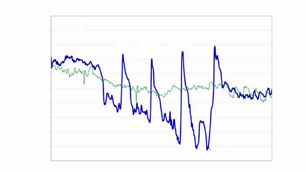
I asked “What do you notice?” and recorded their noticings:
- the blue line is more variable than the green
- there are two lines: blue and green
- there are large peaks and valleys
“What else?”:
- the lines are more similar at the ends
- the maximum points are evenly spaced (“periodic” even!)
- the minimum values are decreasing
- there are small spikes between the dips
- the blue line is thicker than the green line
I asked “What do you wonder?” and recorded their wonderings:
- ECG? Stock market?
- is the scale of the x-axis seconds, minutes, hours, days? (“… because the x-axis is always time.” — Geoff Krall)
- are the lines related? (Ha! Spurious correlations?)
- what’s the y-axis?
- what’s causing the peaks and valleys?
I gradually provided answers to some of their questions. “The lines are related. The green and blue lines represent two successive days, February 27 and 28. The horizontal axis is time of day from noon to six.”
I added a critical piece of information: “February… 2010.” That was enough for some to blurt out “Olympics!” or “Hockey!” I gave them time to talk at their tables. There was a natural transition to “What’s going on?” before I asked the question (just as there’s a natural transition from noticings to wonderings). You can read the graph’s story here.
In the second half, I invited one teacher at each table to try out the strategy. I provided these facilitators with a rough script (anticipated noticings and wonderings, what to reveal and when, the complete graph with all its bits and pieces). They shared the following stripped graph with their colleagues:

“What do you notice?”
- junk foods bottom left, healthy foods top right
- there’s a diagonal line (or y = x)
- some foods are farther away from this line than others
- there are arrows pointing to two foods
It is key that participants notice the line as it implies two variables (that are largely similar). If what’s going on is just a measure of the healthiness of foods, a continuum (a.k.a. a number line) is all that is needed. A coordinate system is overkill. There were some related false starts here (e.g., fat, sugar). I encouraged facilitators to let that play out. Groups self-corrected. The arrows indicate where text boxes have been removed. Learners were told that they could choose to revisit the “stories” of these foods later.
“What do you wonder?”
Facilitators gradually provided answers to their group’s questions. For example, if participants were told that the y-axis represents the percent of nutritionists saying a food is healthy, they reasoned that the x-axis represents another group: the public (or all Americans).
“What’s going on in this graph?”
Groups revisited granola bars and quinoa. They discussed possible reasons for differences in opinions between nutritionists and the public. They noticed and wondered some more.
When planning, I considered slowly providing this information in a series of slides. To learn more about this approach, see Brian’s post.
On Monday, I was invited to Fraser Heights Secondary to be part of their professional development day. I chose to lead teachers through this activity. (Last week, I test drove it with Surrey Math Department Heads.) Teachers–from all departments–were engaged in the activity. Not because of the “real-world” context but because “we had to figure out what was going on.” A math activity.
My plan was to connect this activity to core and curricular competencies. Also, I wanted to ask teachers to consider where–in their discipline, in their practice–they could remove (and gradually provide) information. I wanted to ask teachers to consider where they could ask their students “What do you notice? What do you wonder? What’s going on?” I rushed that. “Never skip the close!” I hope that challenge didn’t come across as hand-waving.
Updates
Jenna Laib (@jennalaib) launched slowrevealgraphs.com!
Additional examples, discussed in BCAMT’s Vector 61(1)…


5 Replies to “The New York Times’ “What’s Going On in This Graph?””